


Creating a Universal Navigation Solution for a Multi-Brand Luxury Rental Property in New York

Overview
Founded in the 1950s, Heatherwood has been a mainstay in Long Island real estate for decades. Today, The company have a portfolio of over 30 residential and commercial properties in prime locations, from Brooklyn to the Hamptons.
The Ask
Like many property rental businesses, Heatherwood hired a CRM-specialized company to help manage and market the Business, create tenant portals, and ease the rental applications from potential tenants. However, the third-party software company had a limited number of web design templates that were not user-friendly and did not serve the goal of Hetherwood to:
- Unify the company as one entity and streamline internal and external communication.
- Tie each property brand to Heatherwood (the properties are considered individual brands and not part of a larger company).
- Create a seamless user experience when exploring different properties and locations.


software company.
My Role
My Role was to Collaborate directly with the client and the third-party software company's team to understand their capabilities and flexibilities to provide an optimized user experience for potential tenants and investors while maintaining the CRM technical features of the third-party software company.
Audit the Existing Landscape & Research
As My team focuses on rediscovering the client's original vision of Incorporating the Heatherwood corporate brand and the Heritage and Heatherwood Communities sub-brands into an integrated, unified web presence and creating a seamless browsing and navigation experience for potential tenants and investors.We decided to run a heuristic evaluation of the existing website to pinpoint all the usability problems and how they impact the overall user experience.
Heurestic evaluation of the existing Navigation, and user experience.

The Existing User Flow & Sitemap
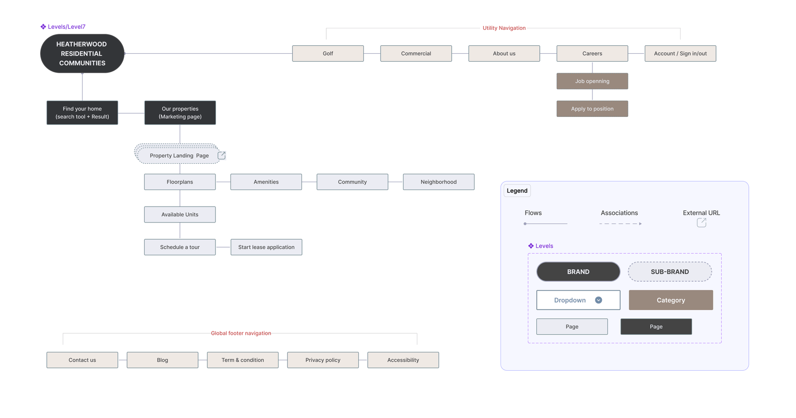
Before redesigning the website, I created a new User flow and a site map of the existing layout to show how things needed to be organizationally shifted and improved to help clarify the site navigation.


Key Findings
The Client has provided us with Premade research about their target audience. Based on the information provided by the Client and the results of the heuristic evaluation, here are the Key Findings:
- The user may get lost between the multiple pages opened.
- Every page has a different navigation bar and different footer.
- The user needs an interactive map to find the desired property location.
- Every page has a different navigation bar and different footer.
- Too many CTAs can confuse the User.
- The user needs a global search bar during the navigation process to be able to find the right property based on location, number of rooms and type of property.
- Every property lives in a separate web page and is not related to Heatherwood.
- Some Third-party features cannot be modified or replaced.
The Solution Approach
After several meetings with the client and the third-party agency, and after collecting all the key findings from the audit and the previous user flow, we have decided to design a universal navigation system to facilitate the transition between the main brand, its sub-brands, and the search property tool page.
Starting with a new architecture
Before we started the design phase, we collected all the categories the client wanted on the new website and worked closely with the content team to establish a new website architecture.
Sketching Explorations
After presenting the new architecture and flow to the client, and collecting comments from Yardi as the 3rd party software company and working on all the limitations we could have on the new redesign, we started by exploring the new navigation design.


The Design
After testing the three navigations options and getting the client's approval on option three, we moved to the design phase.


Reflexion
A universal navigation system is like the exit sign in a big building. It helps users know where they are on the website and find their way around easily.


