


Website Redesign Targetting Three Users Segments

Overview
Kawasaki Engines is a division of Kawasaki Motors Corp, USA. The company distributes gasoline engines for landscape, industrial, and consumer markets. It sells
and services its products through a network of OEMs, distributors, and over 7,700 independent dealers
across America.
The Ask
The company's leadership approached HZDG team to run a new digital marketing campaign, advertisement and rebuild their website with an innovative vision that supports the corporate objectives for the pan-American market.

The Redesign Goal
Help each user segment find products easily, and ensure easy navigation in the website.
Create a clear product display and categorize every section accordingly.
Engage users to explore engines and get details and resources about their products.
Ensure an easy onboarding for users to create a membership account.
Improve imageries and iconography to present the brand in a fresh and minimal aesthetic.
Guide the users to find and contact the closest dealership easily.
Gaining a Deeper Understanding
We initiated the project by conducting several UX workshops to gain a better understanding of the users, and run an in-depth feature and content analysis of most competitors online presence.
Analyzing Competitors'
Strategy from Different Angles
We started the research by identifying current and potential competitors of Kawasaki Engines, exploring their positioning in the market, analyzing their strengths and weaknesses subsequently highlighting trends and uncovering opportunities.

Who Are We Designing For?
To answer this question, we began by gathering demographic data from Google Analytics and then examined their interests, frustrations, goals, and motivations.We have identified three user segments with different needs and goals: the Dealer, the Commercial/Professional, and the Homeowner.

Synthesized Findings
From Business' Perspective
- Offer personalized recommendations and tailored content based on each user segment.
- Optimize the navigation menu.
- Ensure the website is fully responsive and functions seamlessly on mobile devices.
- Implement an intuitive search feature, with advanced filtering options, to help users find products quickly and efficiently.
- Provide comprehensive and clear product descriptions, high-quality images and videos.
- Create a switch language feature for non speaking English audience.
From Business' Perspective
- Differentiate from other competitor by adding features such as Product 360 view & option to hear the engine in action.
- Promote featured products, and new release.
- Create an educational page with how to videos.
- Add links to user manuals for each product.
- Introduce engine accessories to the user by creating quick paths.
- Ensure the website complies with legal standards, and is accessible to users with disabilities.
- Update the visual design to better reflect the company's current branding and values.
Mapping Out the Website
Working closely with our Copywriter, and the Dev team, I created a site map that gives each user segment easy access to the information and the product catalog they need.

Sketching Explorations
After completing the architecture, I sketched multiple user flows to visualize ideas quickly. My focus at this stage is to diverge first, converge later. This also allowed me to gather feedback from the internal team before moving on to full design.

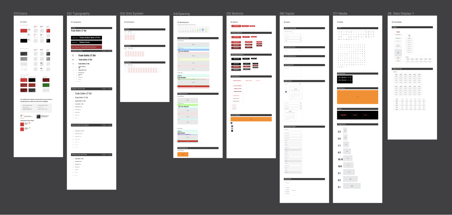
The Design
We have decided to follow a component-based approach for our website, which will have more than 50 pages. Our aim is to create well-documented design components that developers can use to generate new screens based on documented layout rules.


Moderated & Unmoderated Testing
After finishing the first batch of design , we ran a usability testing plan where participants were given test scenarios on the website prototype. We then observed their behavior and experience for further evaluation. Here are some examples of design revisions based on testing results and users feedback:

Final Design
With the help of the improved component library, I quickly delivered an interactive Figma file with a 3 breakpoints layout for each page (Desktop, Tablet, and Mobile) and documented my interactions for the development team. Here are the most important features and pages:


Reflexion
Designing for different user segments involved understanding the distinct needs, preferences, and behaviors of each segment and creating tailored pathways and experiences that cater to these differences.


